
At Value Deco, we continuously monitor global colour and home décor trends to support our customers in developing on-trend, high-performing collections. In this update, we are sharing key insights from RAL COLOUR FEELING 2027+—and how these colours can be quickly translated into commercially successful products.
The 2027+ colour direction highlights a clear market shift toward warm neutrals, earthy textures, and emotionally engaging accent tones. These trends are already influencing buying patterns across major retailers, especially in categories such as ceramic planters, vases, and indoor/outdoor decorative items. For buyers, this means a strong opportunity to refresh assortments with colours that are both trend-relevant and sales-proven.
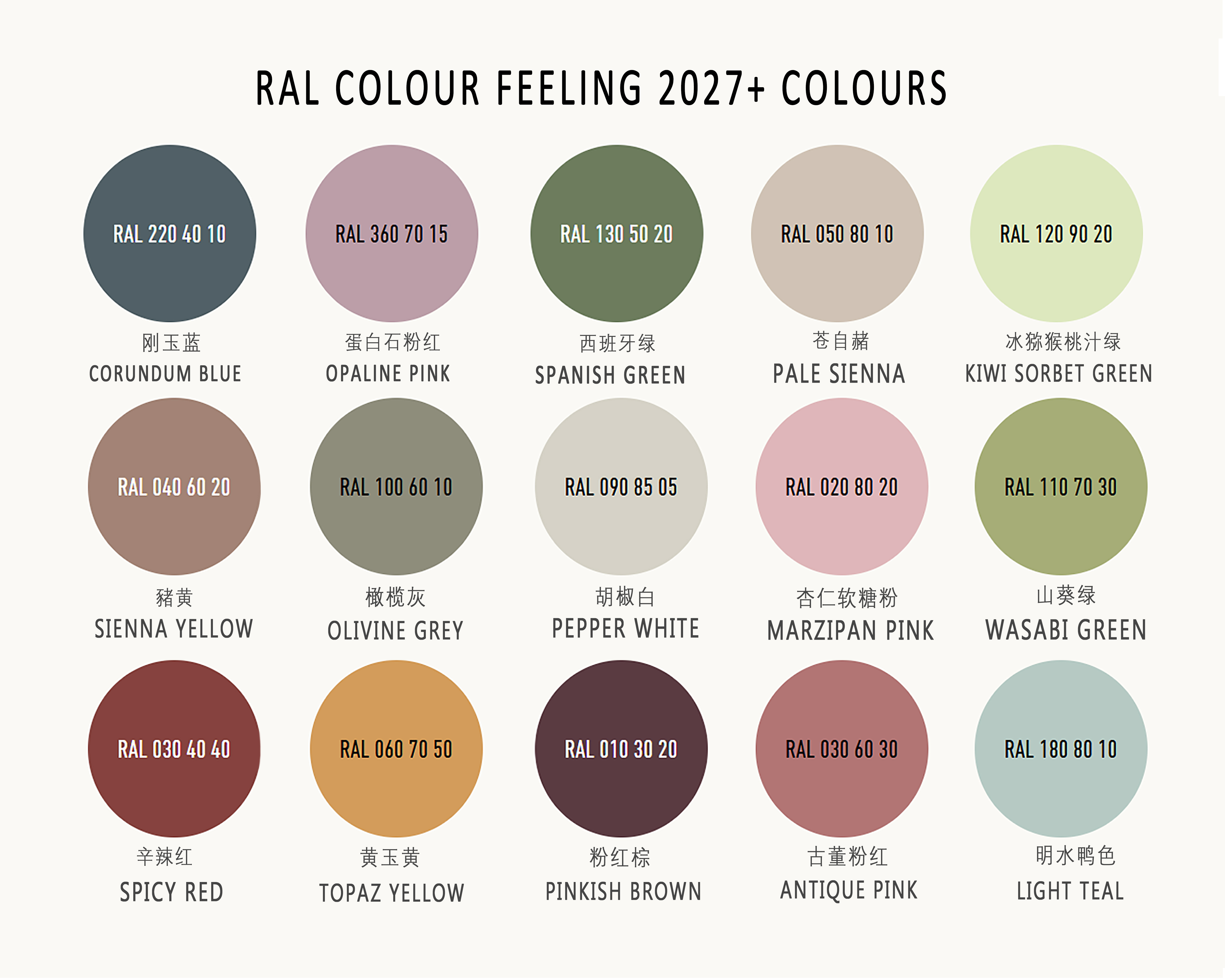
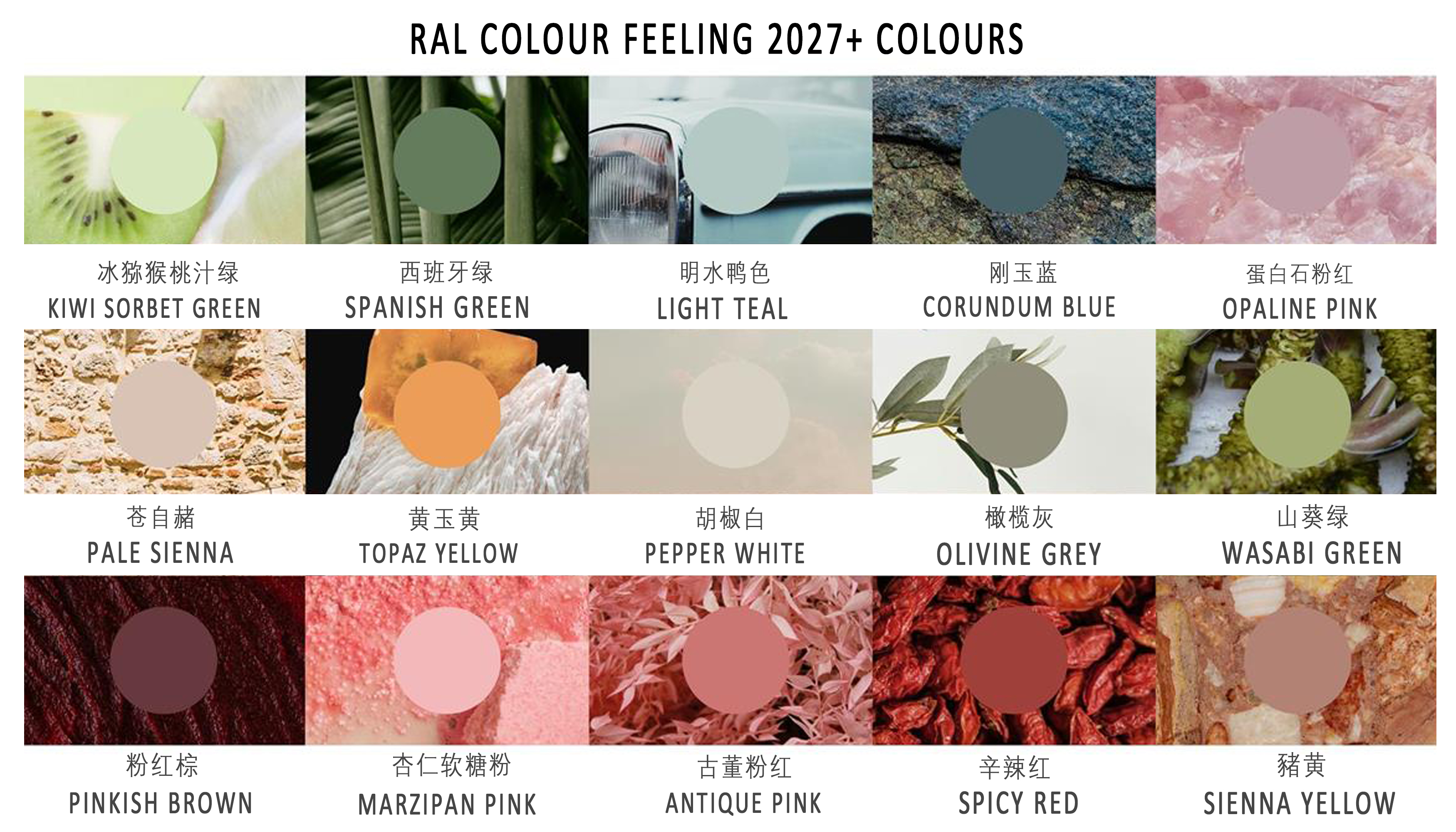
In Value Deco's view, colours are never just visual symbols, but tangible and perceptible carriers of life. For this reason, our team conducted comprehensive tests on the 15 shades of the RAL 2027+ series. We are possitive with the coming result.These 15 colours can not only create rich colour relationships and vivid colour-form combinations, but also have strong adaptability, covering various design scenarios. Whether creating a soft and quiet colour space, or designing interesting, healing and inspiring colour-form combinations, it can be easily achieved
Key Colour Directions for 2027+
1. Vibrant Accent Colours – Bold, Playful, Expressive
Marzipan Pink, Topaz Yellow, Kiwi Sorbet Green, and Spicy Red capture the rise of dopamine décor and high-contrast styling. These energetic tones are perfect for:
- Statement planters and decorative accents
- Seasonal collections and retail highlights
- Adding personality to modern interiors
Inspired by Art Deco’s signature glamour, these hues inject visual impact and emotional energy into any space.
2. Warm Neutrals – Soft, Calm, Timeless
Pale Sienna, Pepper White, and Light Teal reflect the trend of quiet luxury and natural living. These tones emphasize:
- Material authenticity and earth-inspired finishes
- A soothing, wellness-focused atmosphere
- Versatility across everyday home décor
Ideal for core collections and best-selling basics, these colours create a warm, inviting foundation.
3. Stable Base Colours – Grounded, Structured, Enduring
Pinkish Brown, Corundum Blue, Spanish Green, and Olivine Grey serve as the anchor tones in modern design. With their depth and balance, they are perfect for:
- Large-format planters and statement pieces
- Coordinated product lines with strong identity
- Creating layered, architectural interiors
From Trend to Product: Designed for Real Life
We don’t just follow trends—we transform them into sellable, scalable products. Whether you are developing a new retail collection or refreshing your assortment, Value Deco offers:
- Trend-inspired ceramic planters and vases
- Custom color development & OEM/ODM solutions
- Eco-friendly materials and production innovation
- One-stop sourcing with reliable global delivery
Let Colour Shape the Future of Living
As we look ahead, Value Deco will continue to bridge colour innovation and product design, helping our partners stay ahead in an ever-evolving market.
Let colour do more than decorate—let it tell a story, create emotion, and elevate everyday living.
To browse the full collection, inquire about wholesale options, please visit www.valuedeco.net or contact summer@valuedeco.com
Post time: Mar-31-2026